
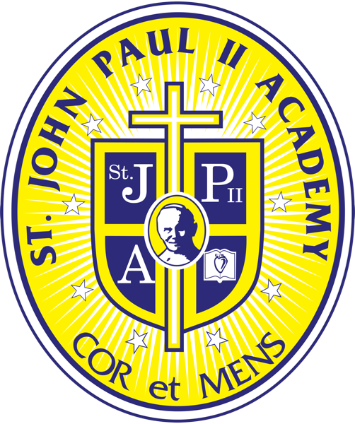
Three symbols. One identity.
Ten stars, ten core values.
Each star on the emblem represents one of the principles we cultivate in every student — the foundation of our character formation.


Reaching beyond the ordinary.
The radiant rays surrounding our emblem stand for exceptionality — the distinct excellence we pursue in every classroom, every program, every student we send into the world.
It is a quiet promise: we will not settle for ordinary when our young people are capable of extraordinary.
Integrity in thoughts and deeds.
At the heart of the emblem stands the crest — a quiet anchor for everything we are. It calls each student to align mind and action: to think rightly, to speak rightly, to act rightly.
It is the moral spine of our school.

More than a logo.
Every shape, every stroke, every color on our emblem carries meaning. Here's what each element stands for.
The School Name
A legacy of St. John Paul II, who epitomizes a life devoted to God and the nation.
Persona
A private, non-sectarian institution — with a vision inspired by St. John Paul II's idea of holistically-formed individuals, drawn from his life's work meeting believers of divergent faith around the world.
The Font Style
Friz Quadrata — chosen to surmount strong passion towards one mission: to nurture mind and heart through a comprehensive, innovative, values-driven program.
The Colors
Yellow Gold — generosity. We hone students to be essential contributors to the nation.
Blue — harmony. We guide students to be fair and just individuals.
The Crucifix
A representation that we are guided by faith and trust in God in everything we do.
The Oval Shape
Symbolizes the school's mission and commitment to nurture its students to be globally competitive.
Cor et Mens
Heart and Mind.
Two faculties. One formation. Every student, every day.